Cherries Sisterhood
About The Project
Discover the creative potential of our template on our project pages, where different shortcodes are used to craft captivating content.
Date
May 2018
Role
Branding, Graphic Design
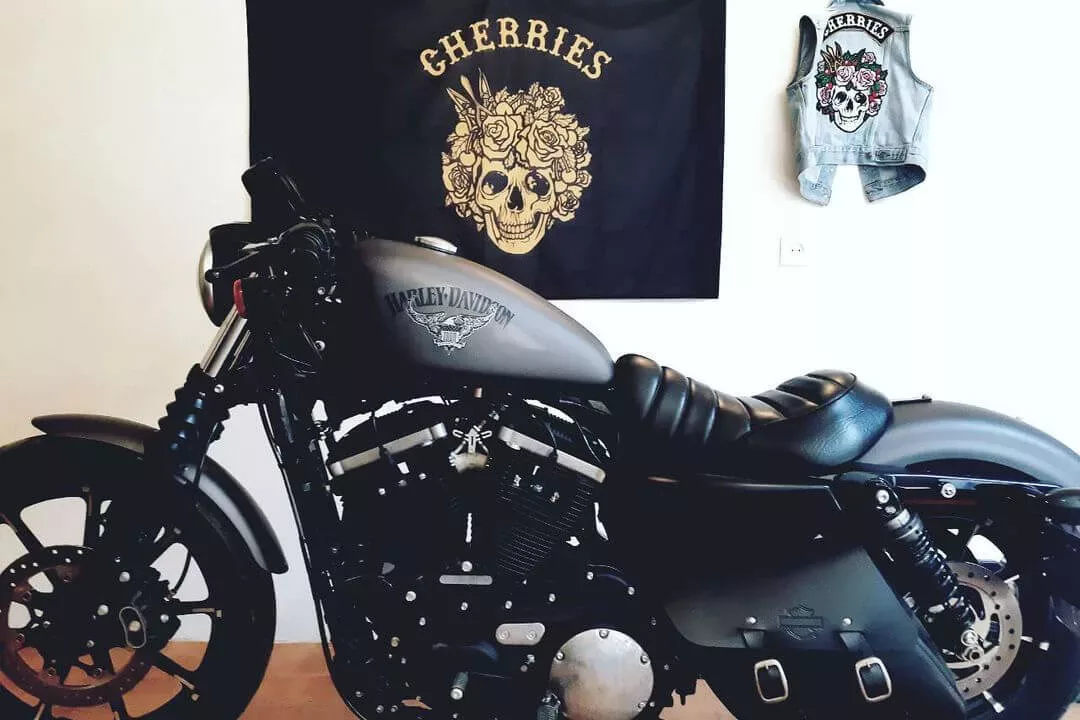
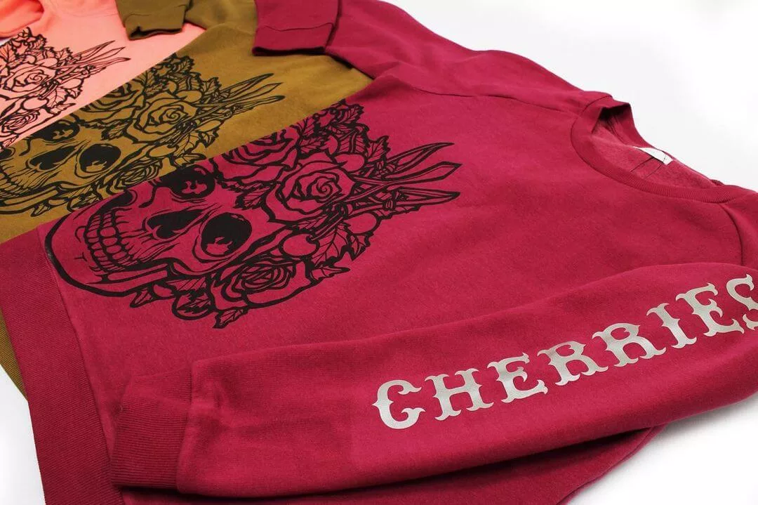
Girl, Roads & Patches
Branding
Graphic Design
Illustration
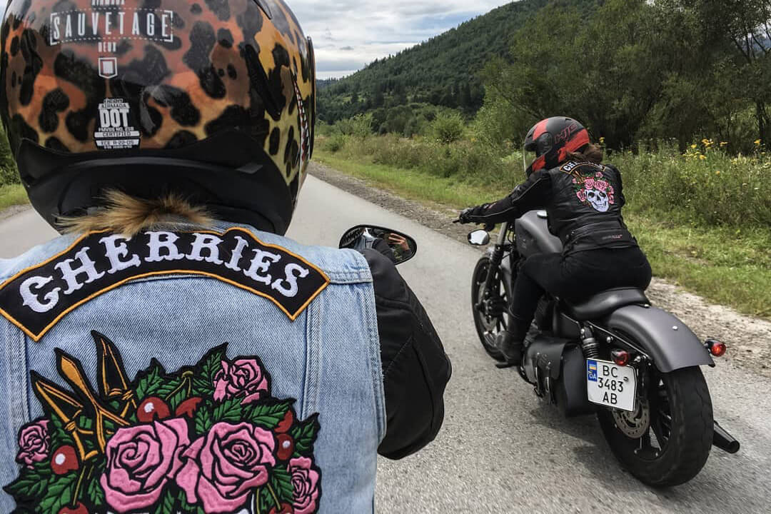
Cherries, the trailblazing sisterhood of female bikers in the heart of Western Ukraine, came roaring to life in 2018. They’re not just a club; they’re a fierce, unapologetic force in the world of motorcycle culture, where the symphony of thundering engines is their anthem.
Creating this identity was no ordinary project; it was a voyage into the realm of vivid, tangible creativity. It was a chance to escape the confines of the “cold digital” world and craft an identity for vivacious, adventure-thirsty women who live life on two wheels, for whom every day is a new escapade, and every ride a journey of passion. Cherries aren’t just a club; they’re an embodiment of freedom, empowerment, and the thrill of the open road.
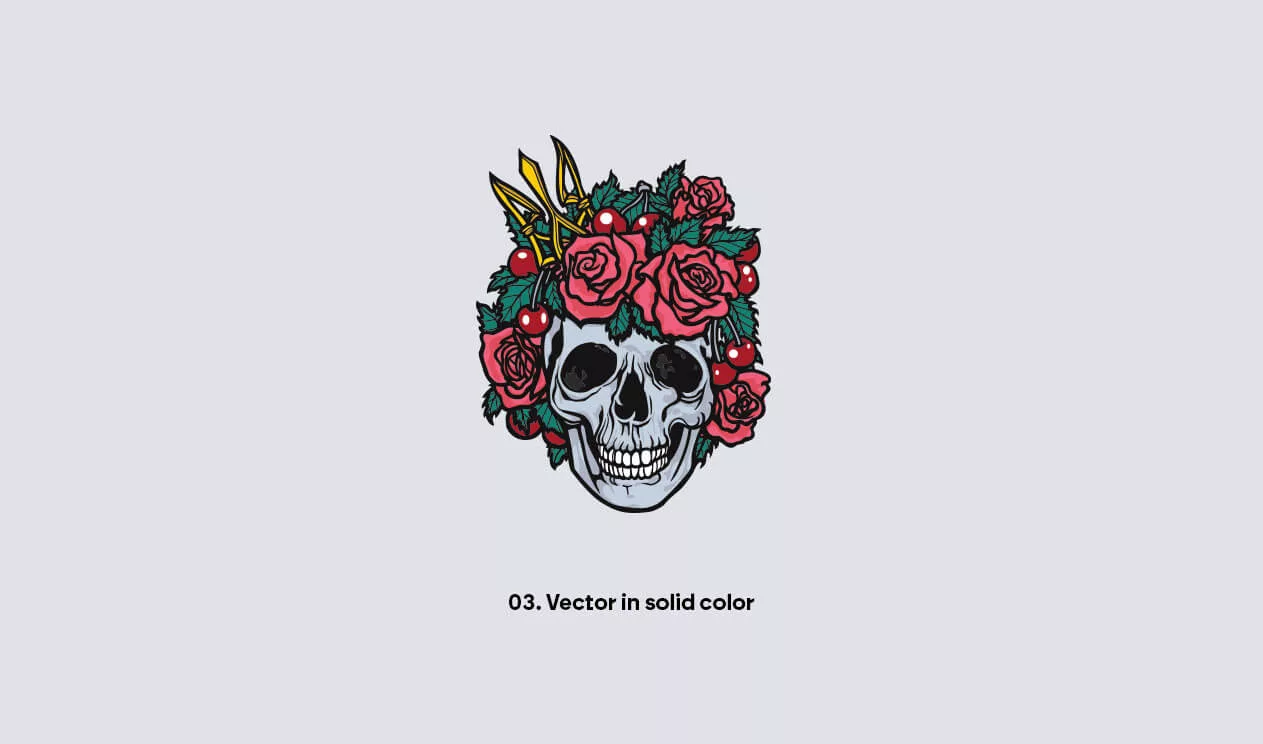
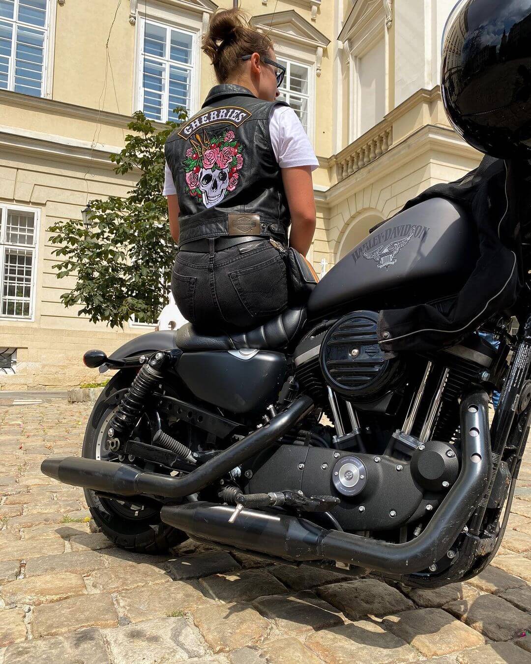
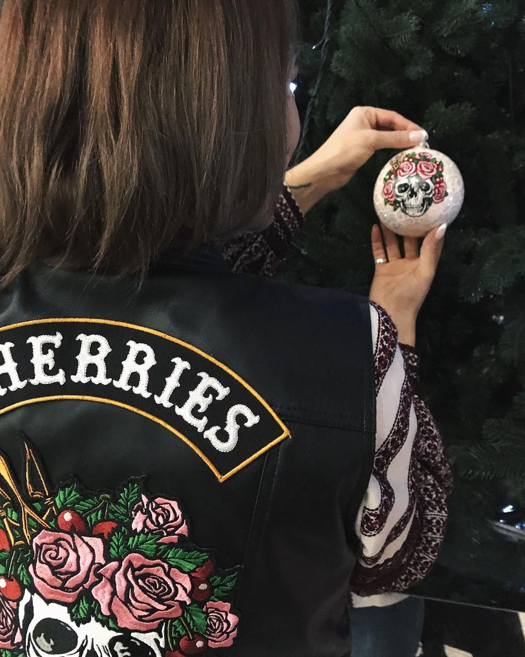
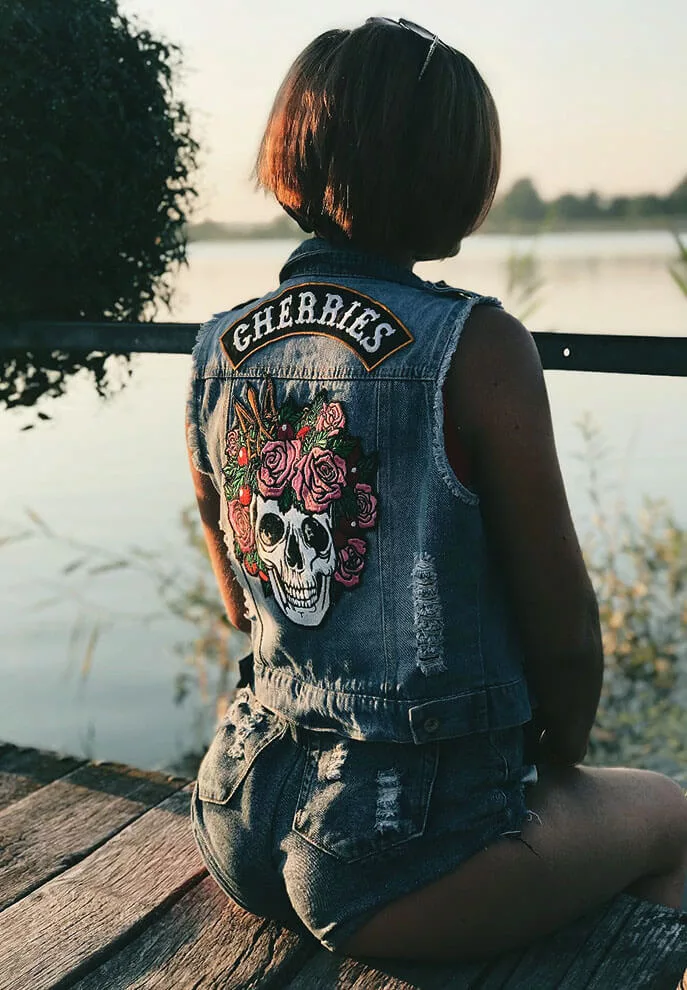
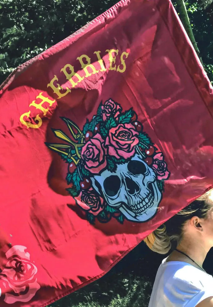
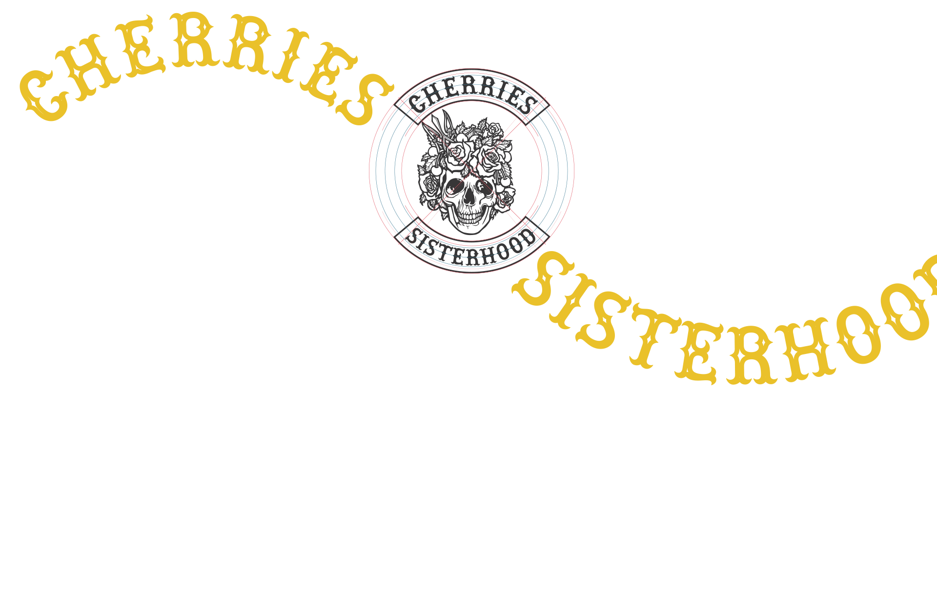
The Patch
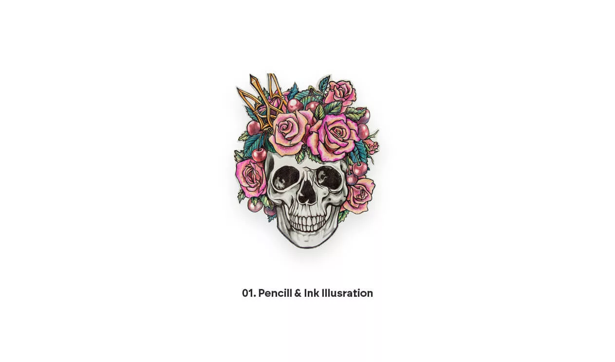
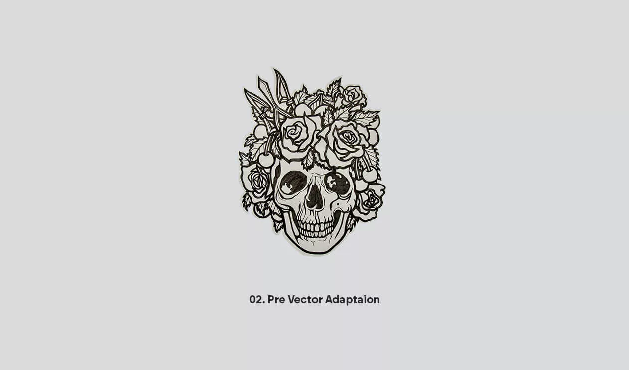
The genesis of this remarkable idea and the patch that embodies it sprung from the fertile imagination of Rubiks Cube, a masterful tattoo artist and illustrator. The patch is more than just a badge; it’s a fusion of powerful symbols. The delicate beauty of roses and the bold allure of cherries are harmoniously entwined with the timeless emblem of a skull. This skull is no mere ornament; it’s a spiritual cornerstone, a reminder of life’s impermanence.
But the patch doesn’t stop there; it’s a tribute to their Ukrainian roots. The national trident symbol, the Tryzub, is a hairpin, gracefully holding everything together. It’s a nod to their heritage, a reminder that their wild spirit has deep roots in their homeland.

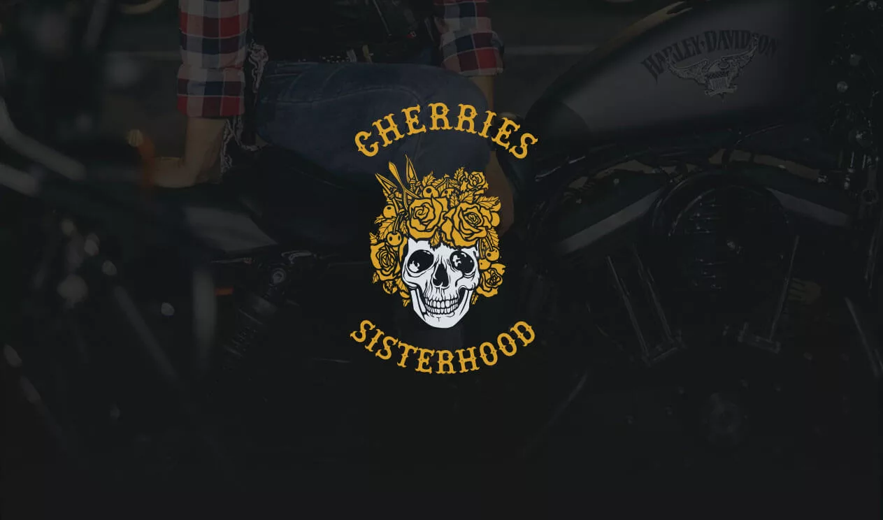
Unveiling the Women Bikers Colors
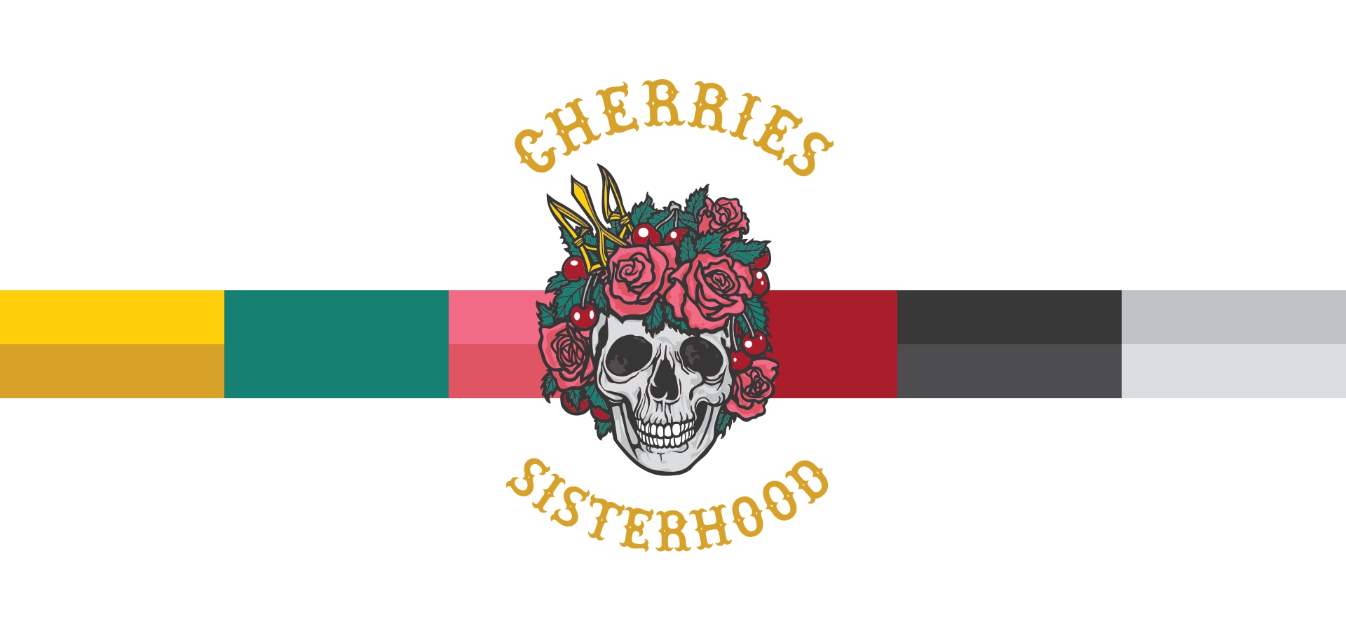
In the realm of graphic design, the creation of a logotype is a profound journey that encapsulates an entity’s essence within a visual identity. When tasked with crafting a logotype for a group of dynamic women bikers, the challenge was to infuse their vibrancy, spirit, and unity into a single symbol. The focal point of this design conundrum lay in the realm of color, where we ventured into two distinct directions, each with its own narrative.
The first direction led us down a path of timeless elegance and bold minimalism. It was the choice of a single, solid golden color set against a profound black backdrop. This choice was a reflection of strength, determination, and the unmistakable allure of gold, symbolizing the wealth of experiences these women have gathered on their two-wheeled adventures. The black canvas, on the other hand, spoke of the shadows they’ve conquered, the mysteries they’ve unveiled, and the daring spirit that fuels their journeys. The result was a logotype that exuded an air of sophistication and power, just like the women it represented.
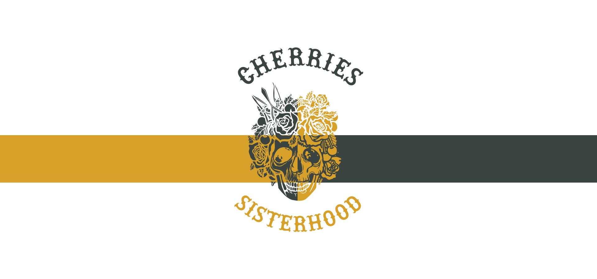
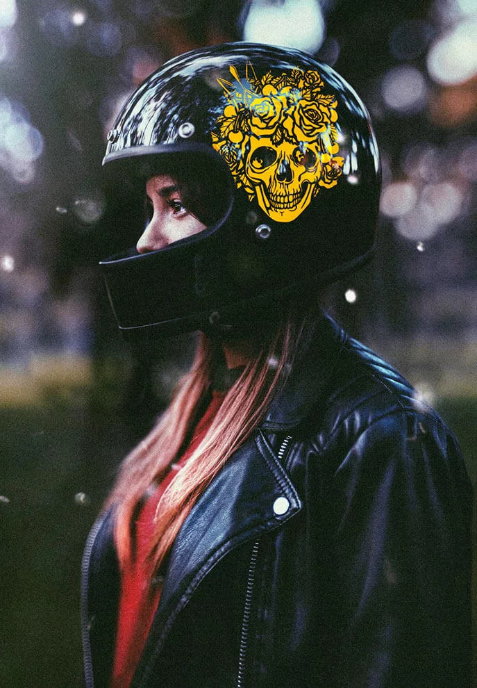
Conversely, the second direction ventured into a realm of efflorescence. A full-color bloom, a blooming flower, became the emblem of choice. In its riot of colors, this logotype was a celebration of life’s vividness and the diversity of the women who form this spirited community. Every petal was a unique journey, every shade a distinct personality, and every bloom a reminder that beauty comes in many forms. The full-color spectrum symbolized the multifaceted nature of these women, reflecting their individuality and collective strength.
The Women Bikers Logotype, in its dual design directions, mirrored the duality of the women it represents: strength and softness, minimalism and vibrancy, unity and individuality. It’s a reminder that the world of design, like the world of women bikers, is boundless, offering endless possibilities for creative expression and storytelling. In the end, the choice between these directions was not one of right or wrong but a reflection of the multifaceted nature of the women who ride under this emblem.
Cherries Lifestyle