Walkbuddy App
WalkBuddy
Branding
UX / UX
Mobile Responsive
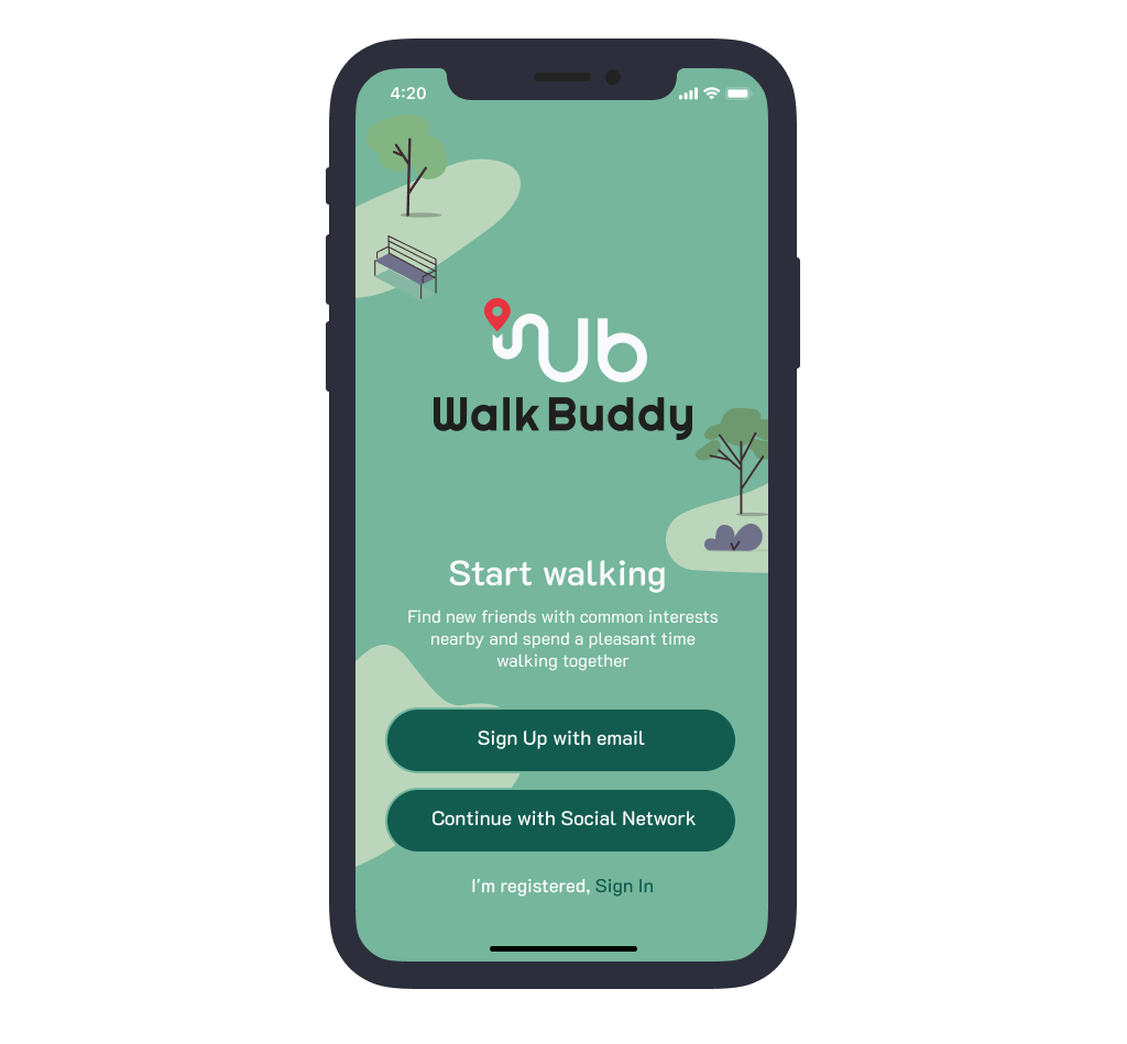
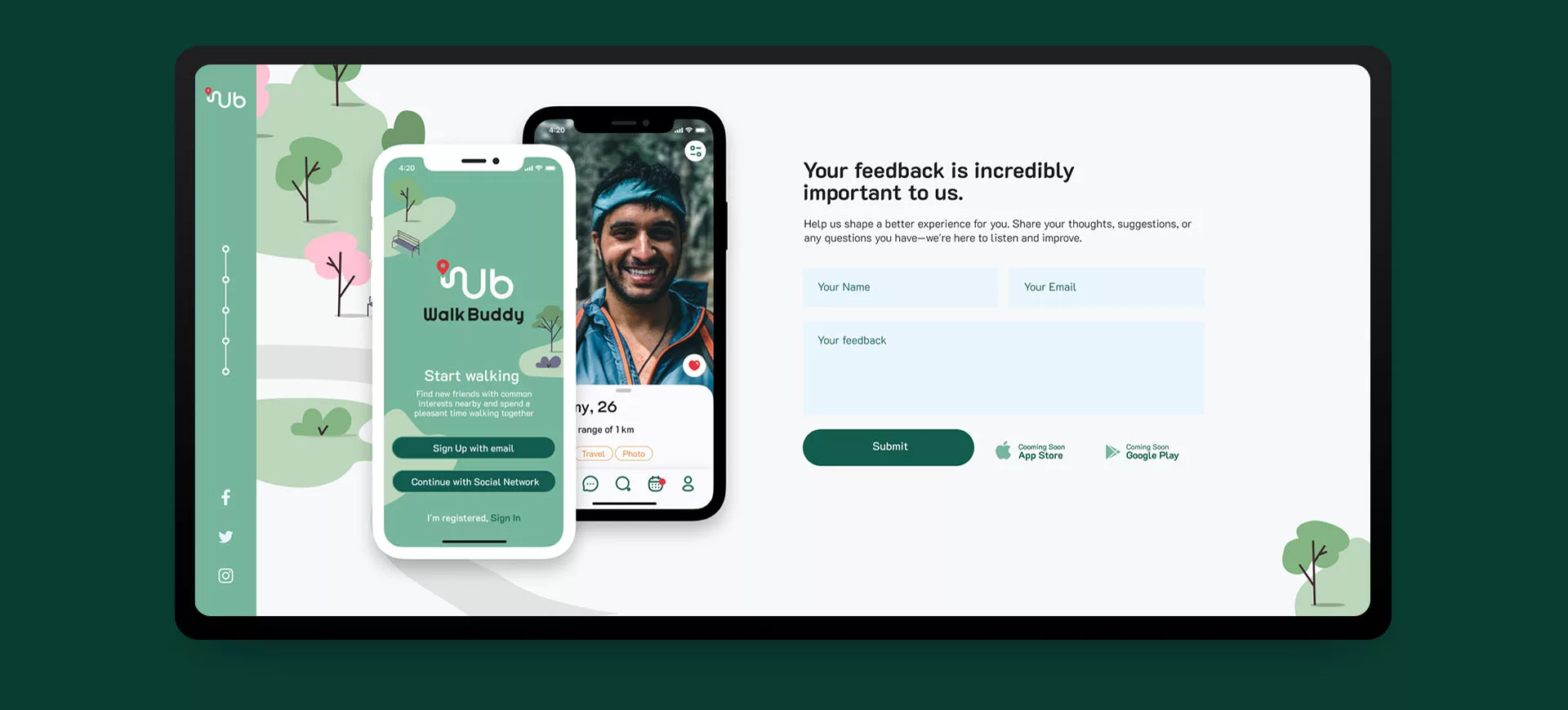
The UI/UX project, WalkBuddy, embarked on a journey to enhance user experience and interface design for a mobile application catering to individuals seeking companions for walks. Joining the project midstream, our focus was on refining the UI, constructing a seamless prototype, and creating a captivating landing page to encapsulate the essence of the app.
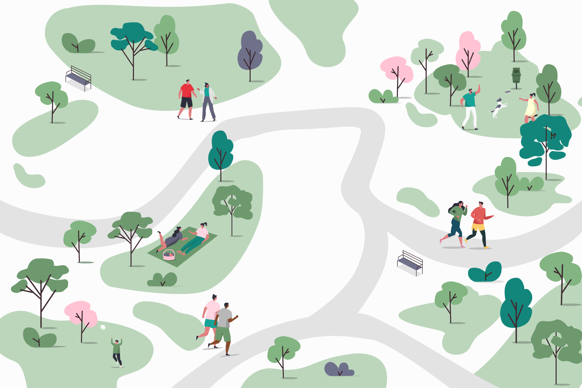
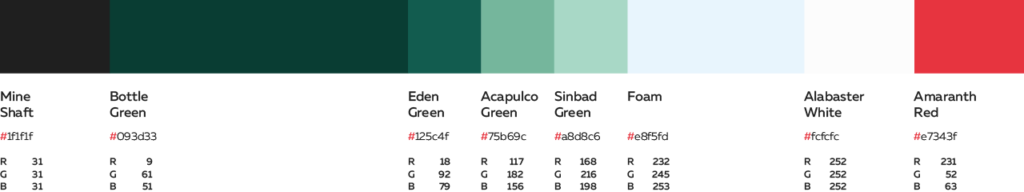
In crafting WalkBuddy’s identity, we curated a captivating logo and distinctive branding infused with a green color palette. The logo embodies the essence of companionship and exploration, symbolizing shared journeys through nature-inspired hues. Our chosen shades of green evoke vitality, growth, and a sense of harmony, inviting users to connect with nature and each other. Coupled with a carefully selected typeface, our branding strikes a balance between modernity and approachability, welcoming users to join in the shared experience of finding walking companions.
Part I
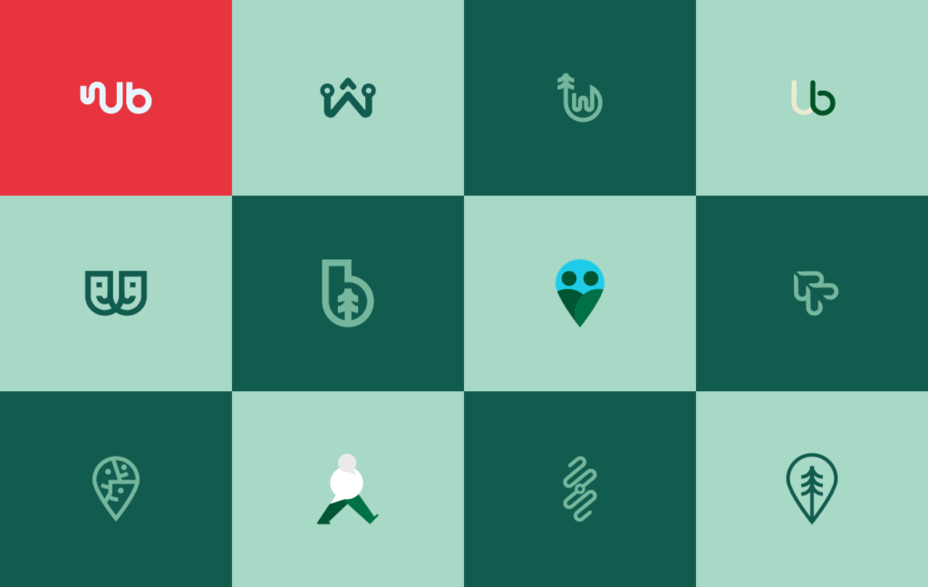
Logo & Brand Colors
Simply define your images, specify the image you want to zoom in on and set the desired repeat behavior.
The Pictogram
Conception

We developed this logo by ingeniously intertwining the letters ‘W’ and ‘b,’ symbolizing the initials of WalkBuddy. These letters form shows two distinct paths that converge, mirroring the unity found in walking companionship.
Storytelling & Illustrations
Part II
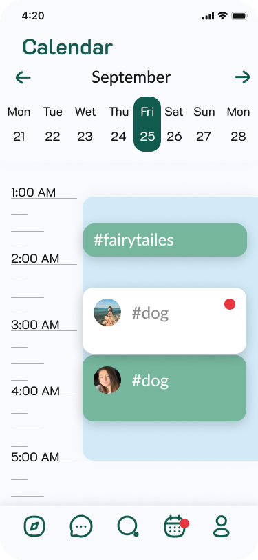
Mobile App Redesign
Simply define your images, specify the image you want to zoom in on and set the desired repeat behavior.
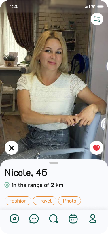
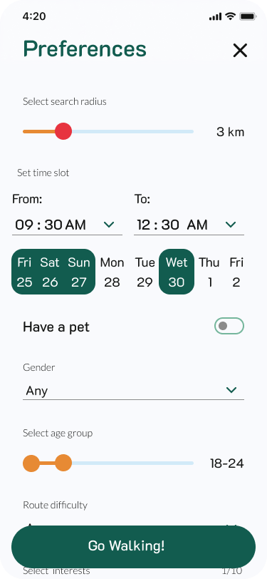
Mobile Design Workflow
Creating a seamless user experience (UX) for the “Sunday Estate” project involved navigating diverse user roles within the real estate ecosystem. From tenants seeking apartments to brokers, realtors, property owners, super admins, and moderators, each role was pivotal to the platform’s functionality.
The low-fidelity user map emerged as an essential tool, allowing us to chart the pathways of each user persona within the platform. It illuminated the interplay between roles, needs, and interactions.
Accommodating these diverse user personas emphasized the importance of an intuitive, adaptable design. This low-fidelity user map became the blueprint for a user-centric approach, ensuring accessibility, efficiency, and satisfaction across the spectrum of roles within the “Sunday Estate” platform.
User map not only guided our design but also fostered a cohesive environment, aligning our team’s efforts to deliver an interface that seamlessly catered to the unique needs of every user role
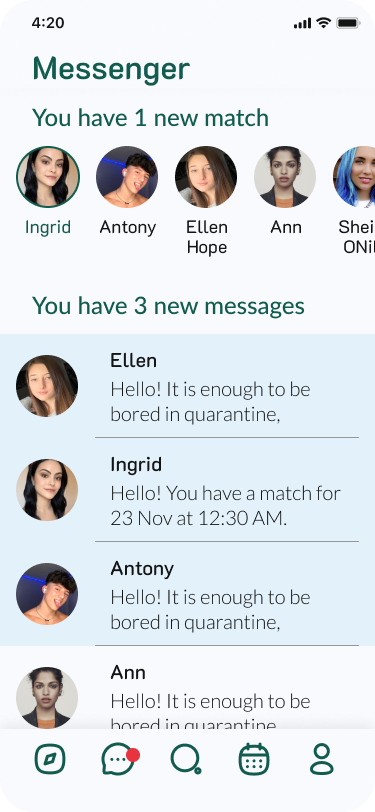
Essential Communication
Creating a seamless user experience (UX) for the “Sunday Estate” project involved navigating diverse user roles within the real estate ecosystem. From tenants seeking apartments to brokers, realtors, property owners, super admins, and moderators, each role was pivotal to the platform’s functionality.
The low-fidelity user map emerged as an essential tool, allowing us to chart the pathways of each user persona within the platform. It illuminated the interplay between roles, needs, and interactions.